Making Retail Display Plinths for Blundstone Australia
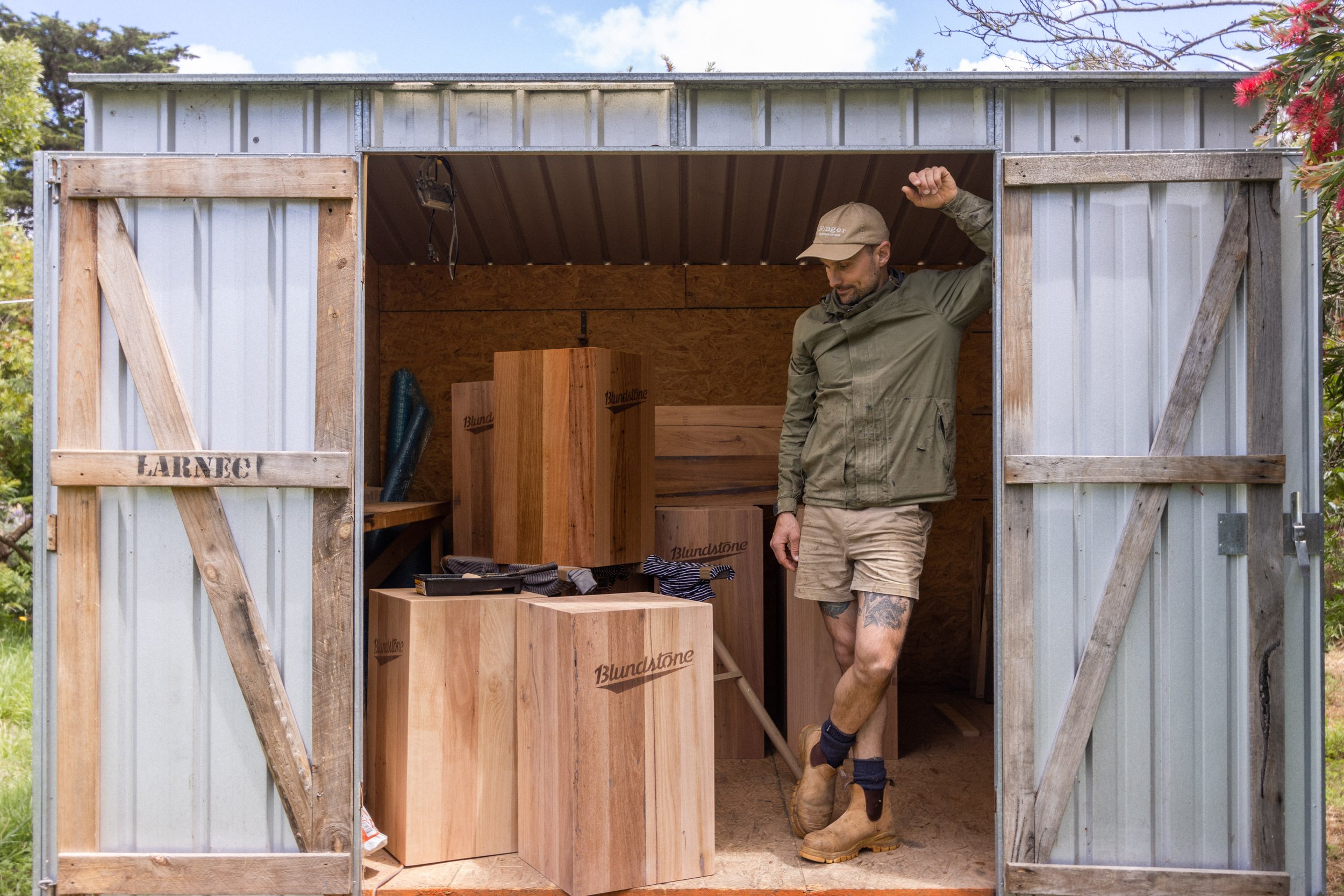
We were stoked when iconic Australian brand, Blundstone contacted us to design and make plinths to display their boots in retails stores. It was a complete shift in the workshop from making beds but a really fun and creative project to get stuck into. We took the opportunity to use different materials, learn new skills and test new techniques.
Timber Selection:
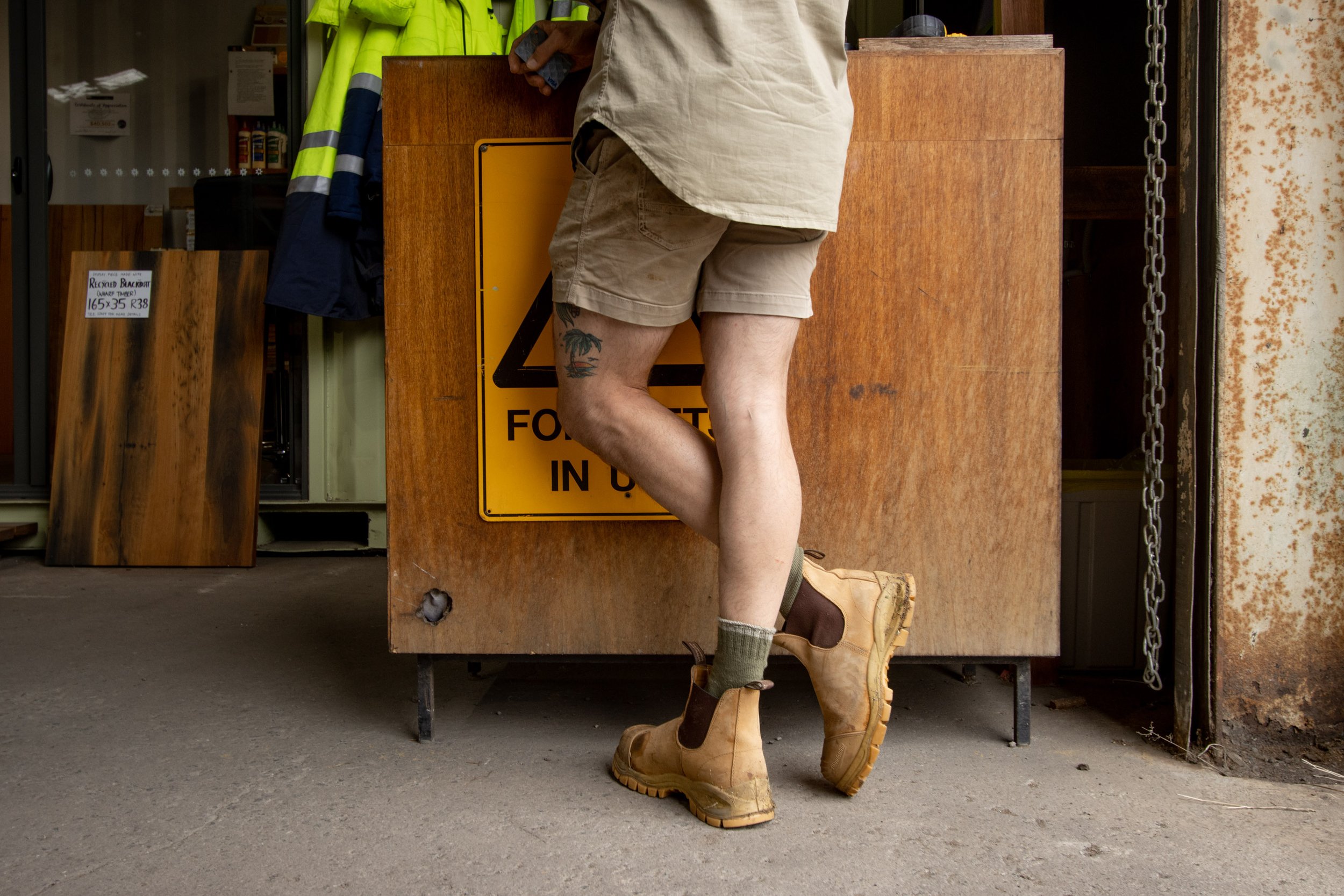
For this project we selected recycled messmate lining boards that are milled locally at Timberzoo, a timber yard in Geelong. It was our first trip as a family to the timber yard and Al enjoyed showing Goldie around … a place I’m sure she’ll get to know well!! All of the timber has come out of demolished buildings and has been milled into thin boards, the beauty about this project was that we were able to use up all of their short pieces that aren’t desirable for larger builds!
Creating the panels:
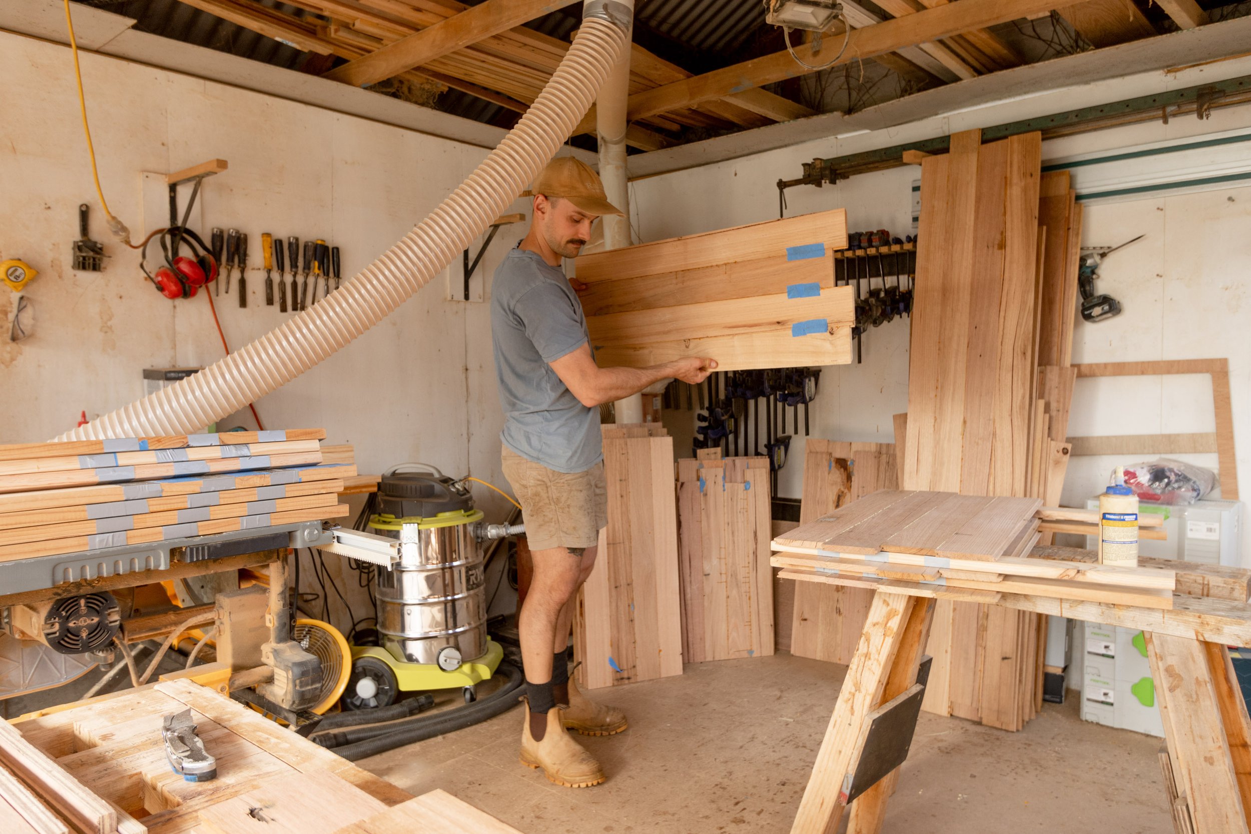
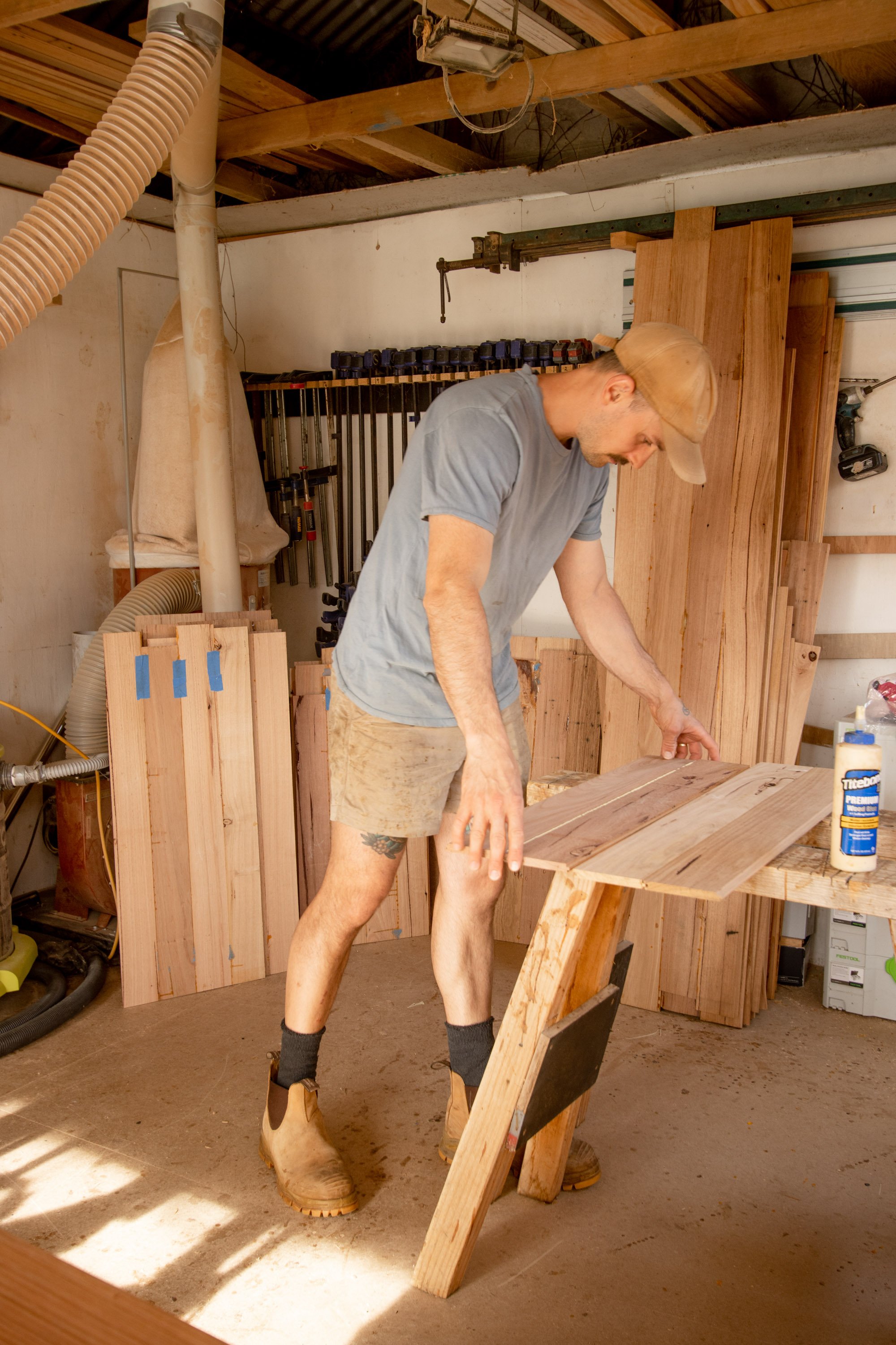
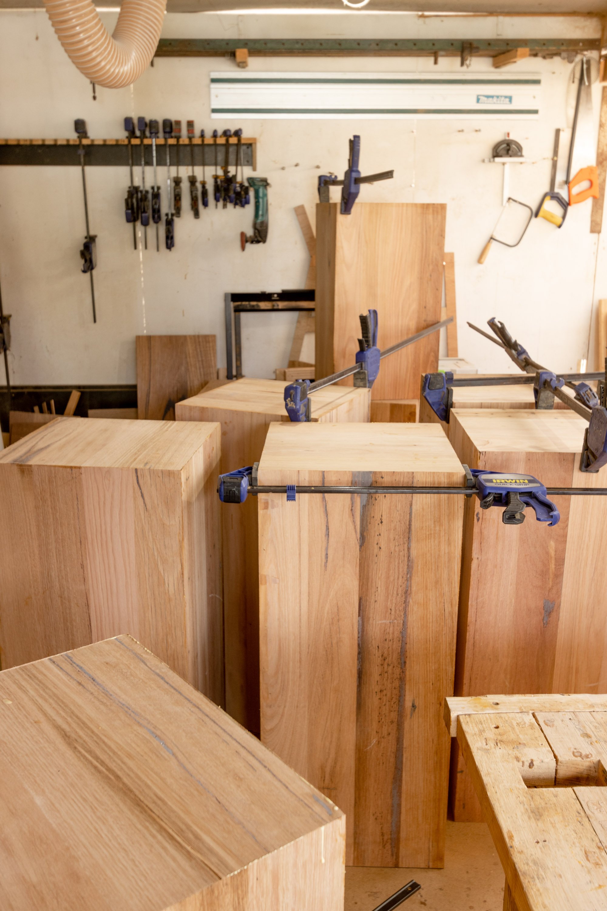
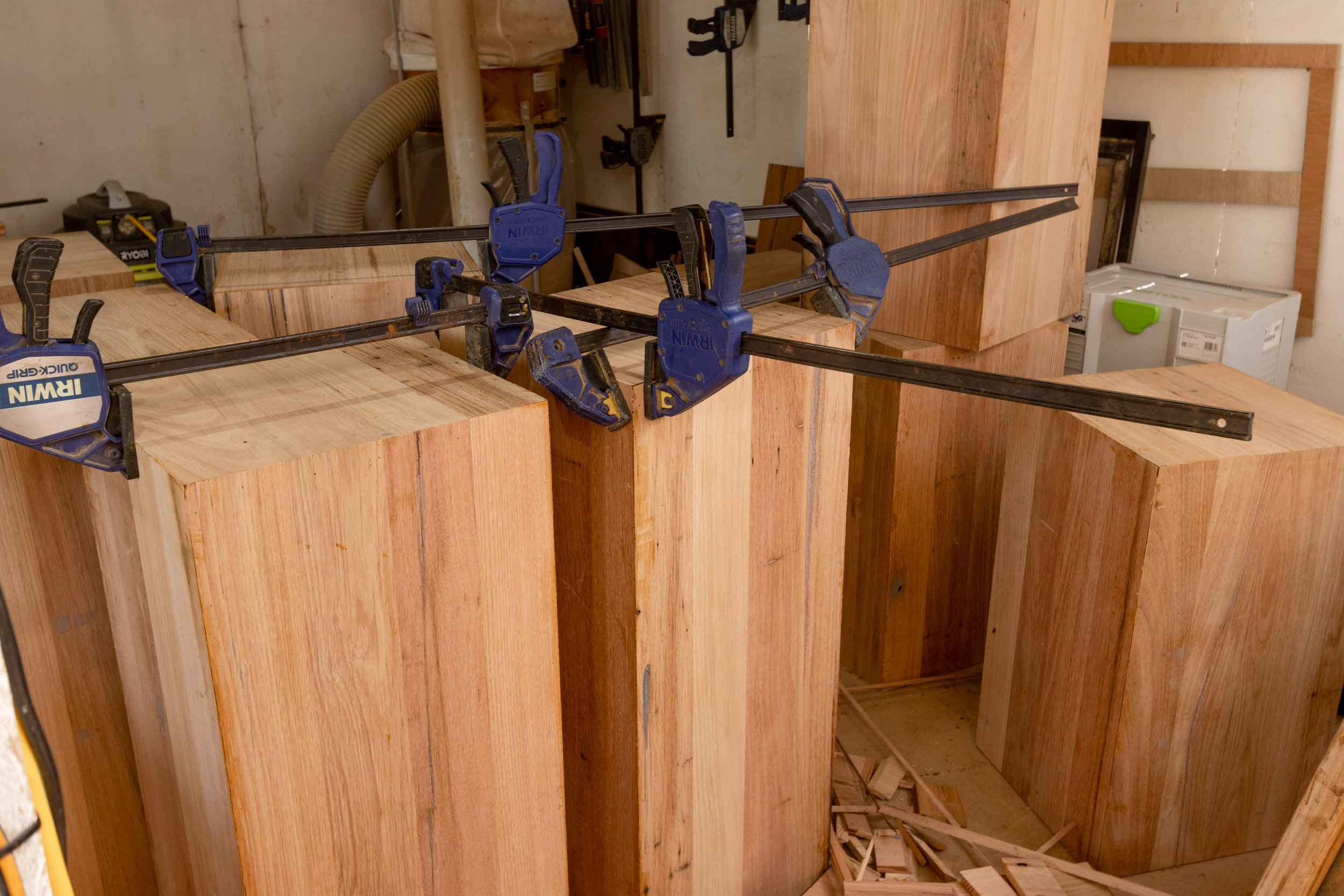
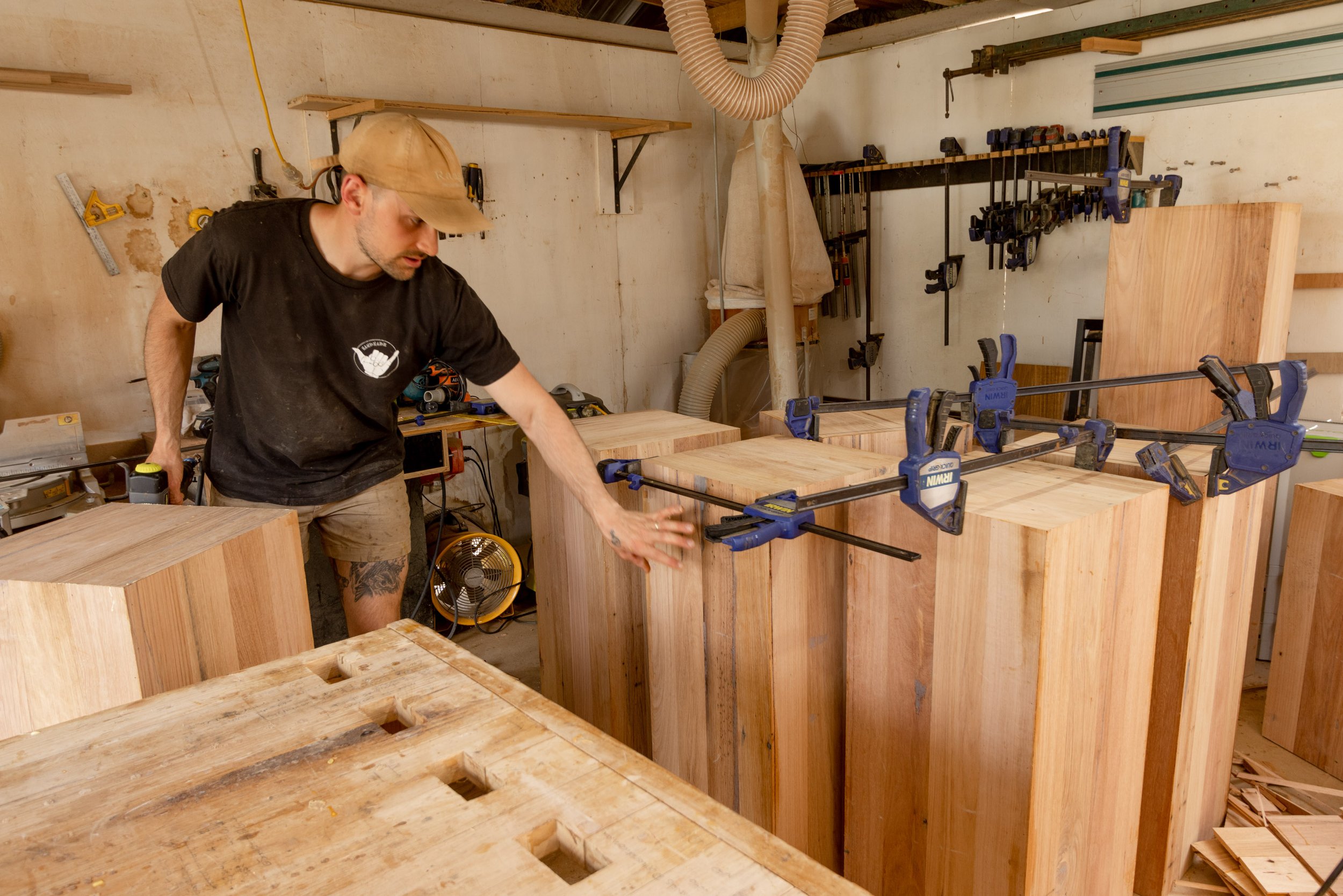
The first step was to glue up all of the panels and setting them aside to dry. As we made 12 plinths at 3 different heights that’s 60 different panels to glue up … 4 sides and the lids. We did this in batches over a few weeks as we were working with minimal clamps. Once the panels were dry we went through adding resin to fill in the grain and existing nail holes that are prominent when using recycled timber .
Forming the boxes:
All of the edges were cut on the table-saw and mitred together, Al used glue and nails to join the boxes together around an internal structure so that they boxes ended up perfectly square.
Adding the Blundstone branding:
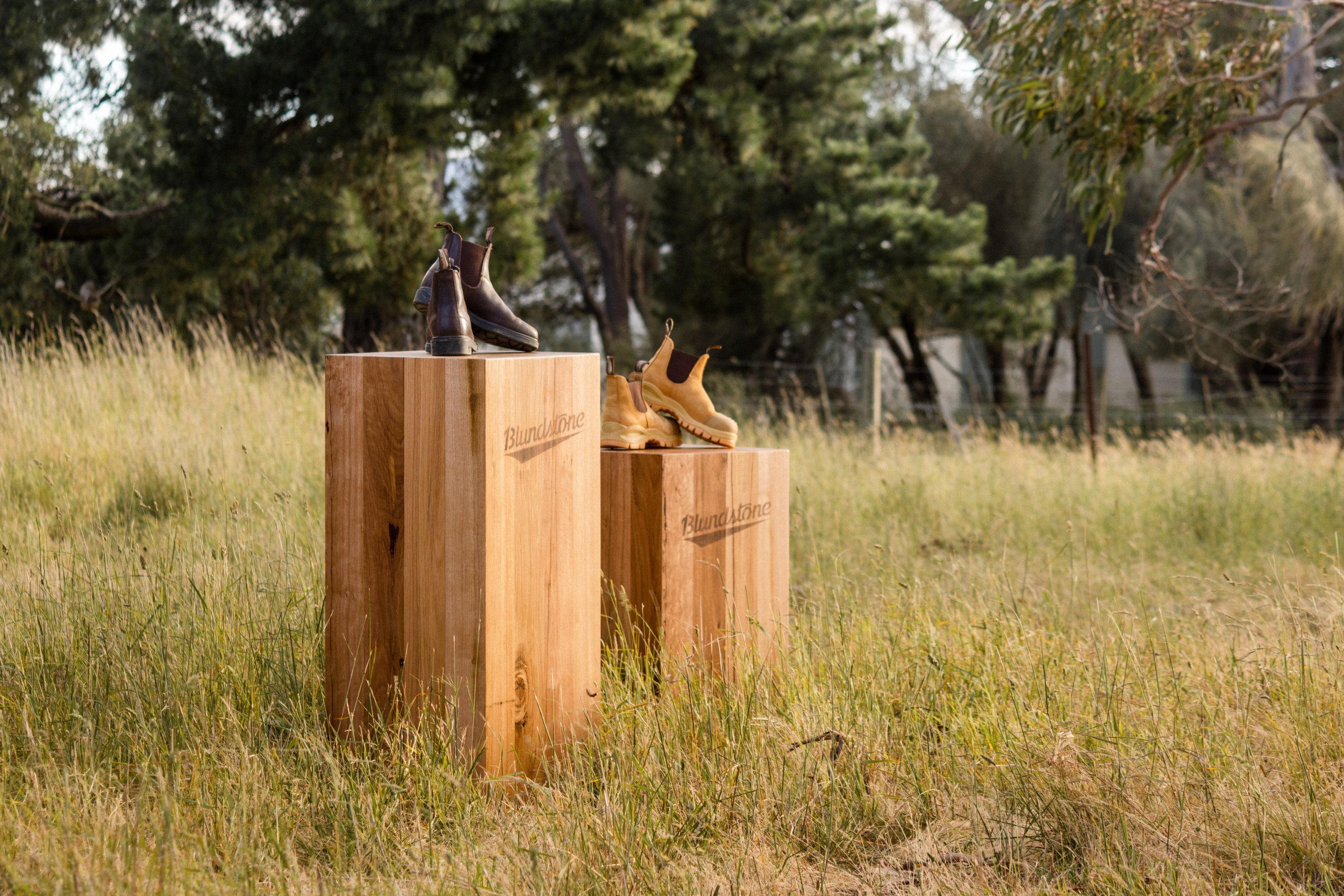
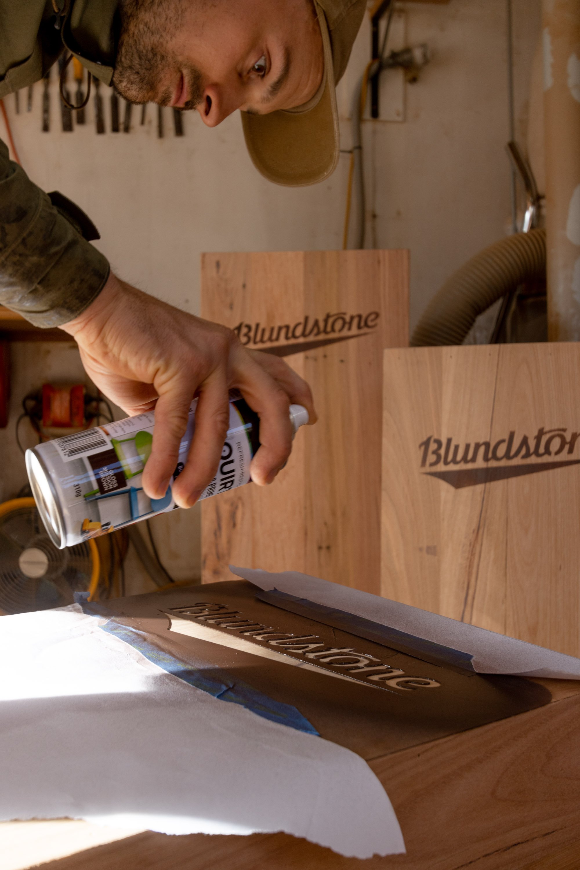
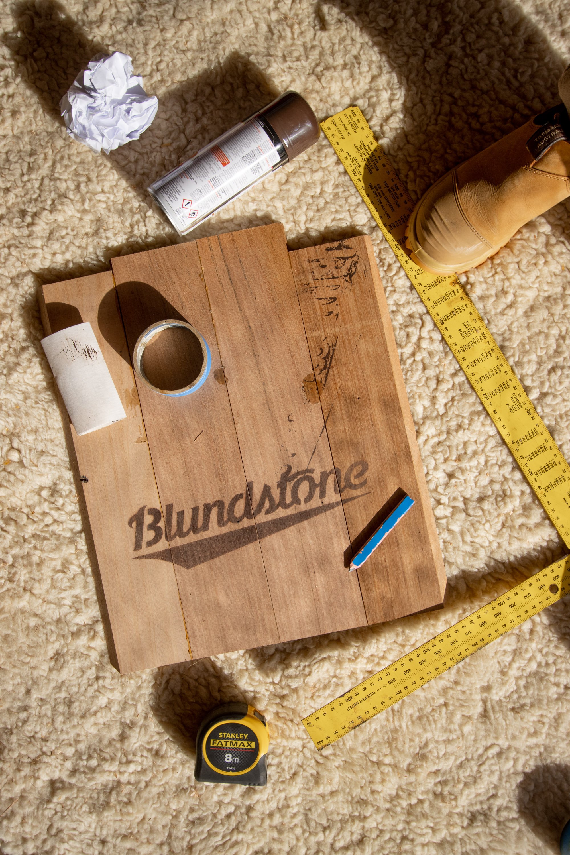
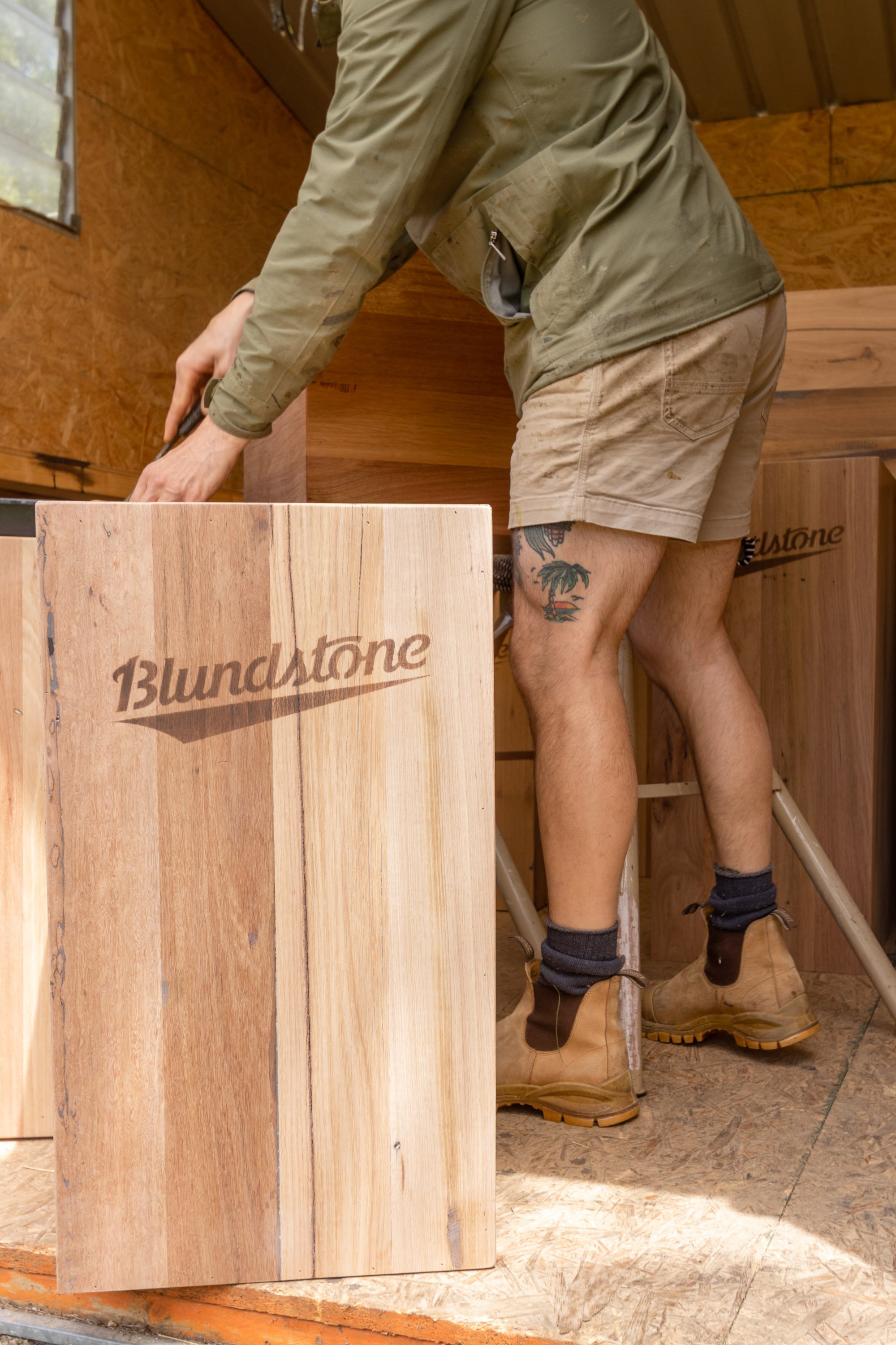
The original plan was to burn the logo into the timber and we tried a technique that uses a chemical and a blowtorch but after many tests we were’t happy with the result. We played around with a few other options and found that using a brown spray paint and light sand gave us the look we were aiming for!
Sanding the plinths:
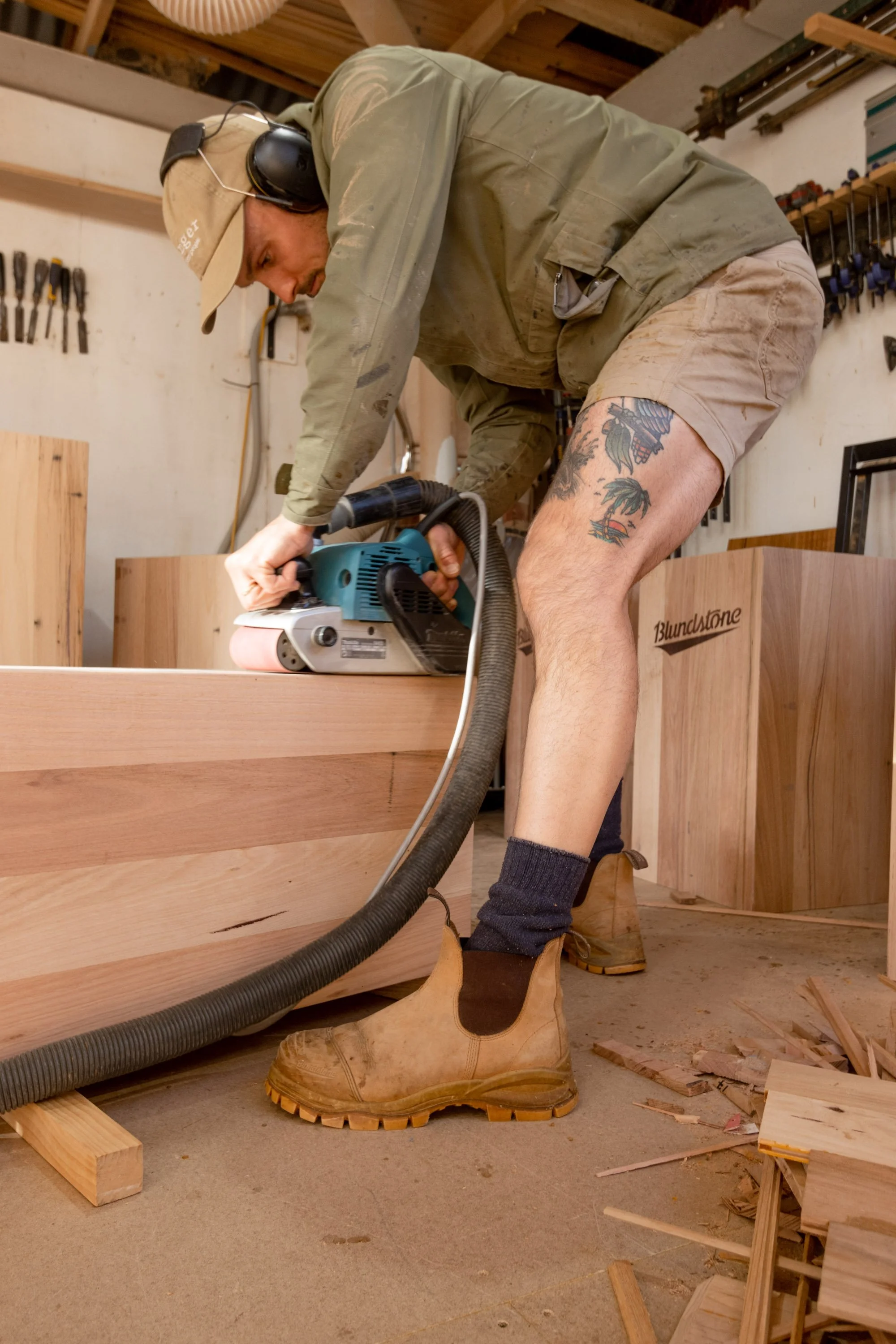
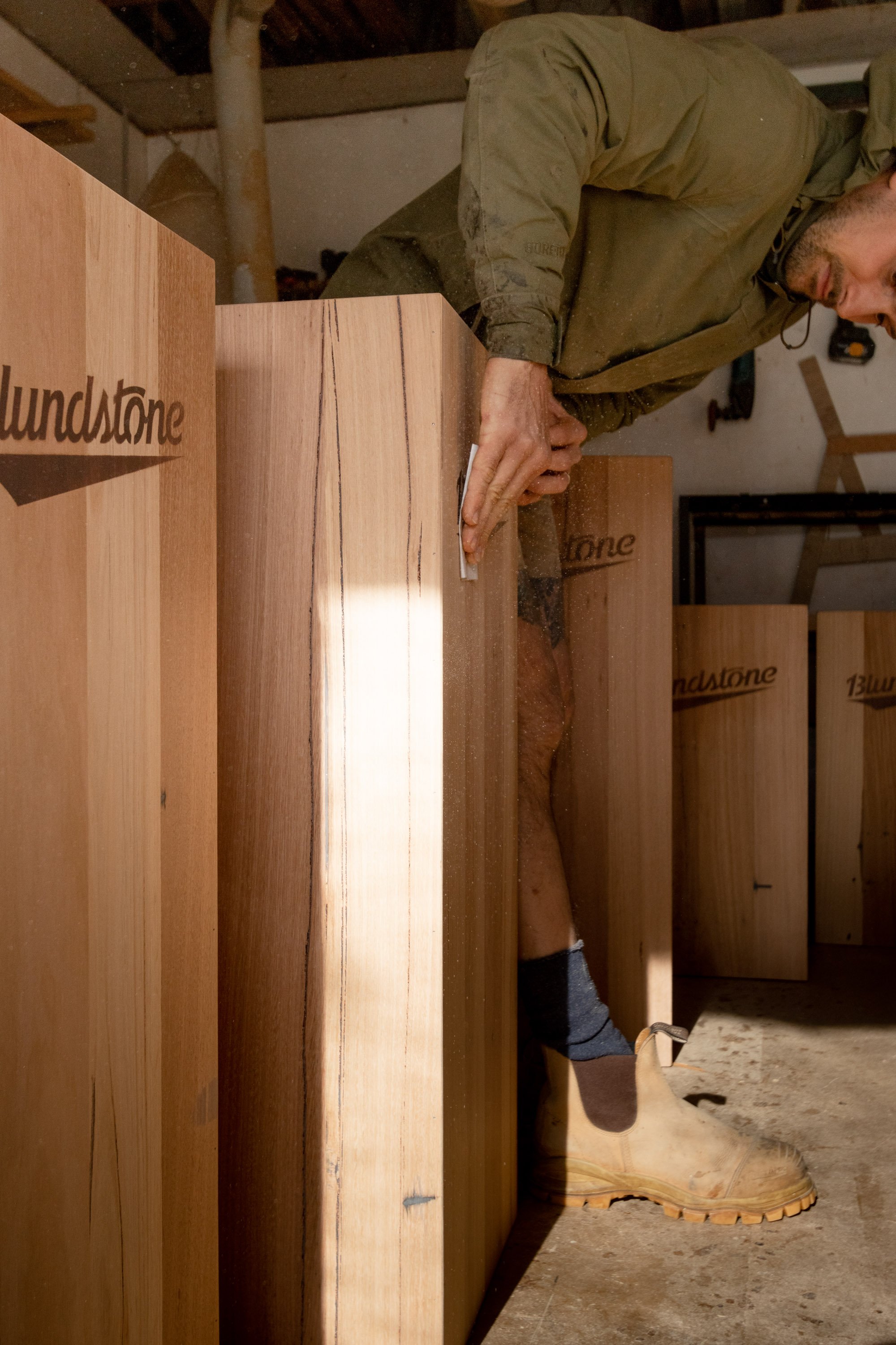
We then went through and double-checked that all gaps and grain were filled and did some last minute sanding touchups.
The finishing touch:
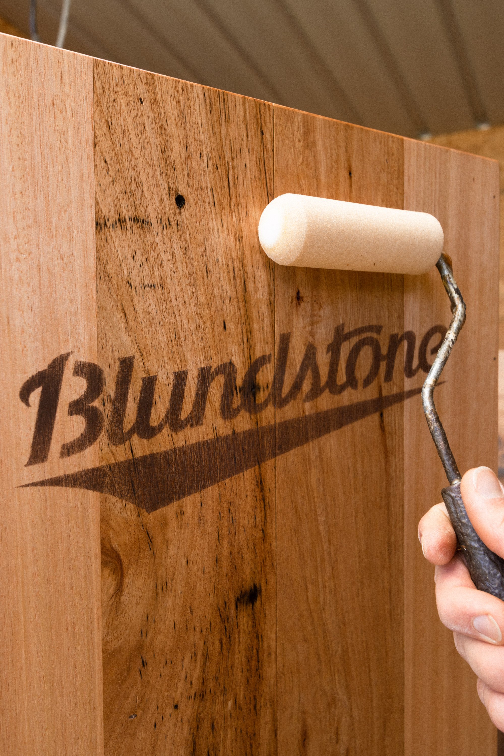
Now that the construction of the plinths were complete it was time to seal them, we used a hardwax oil to protect the timber and bring out the natural feature. We did a light sand in-between coats (careful not to mess with the Blundstone logos).
The finished result:
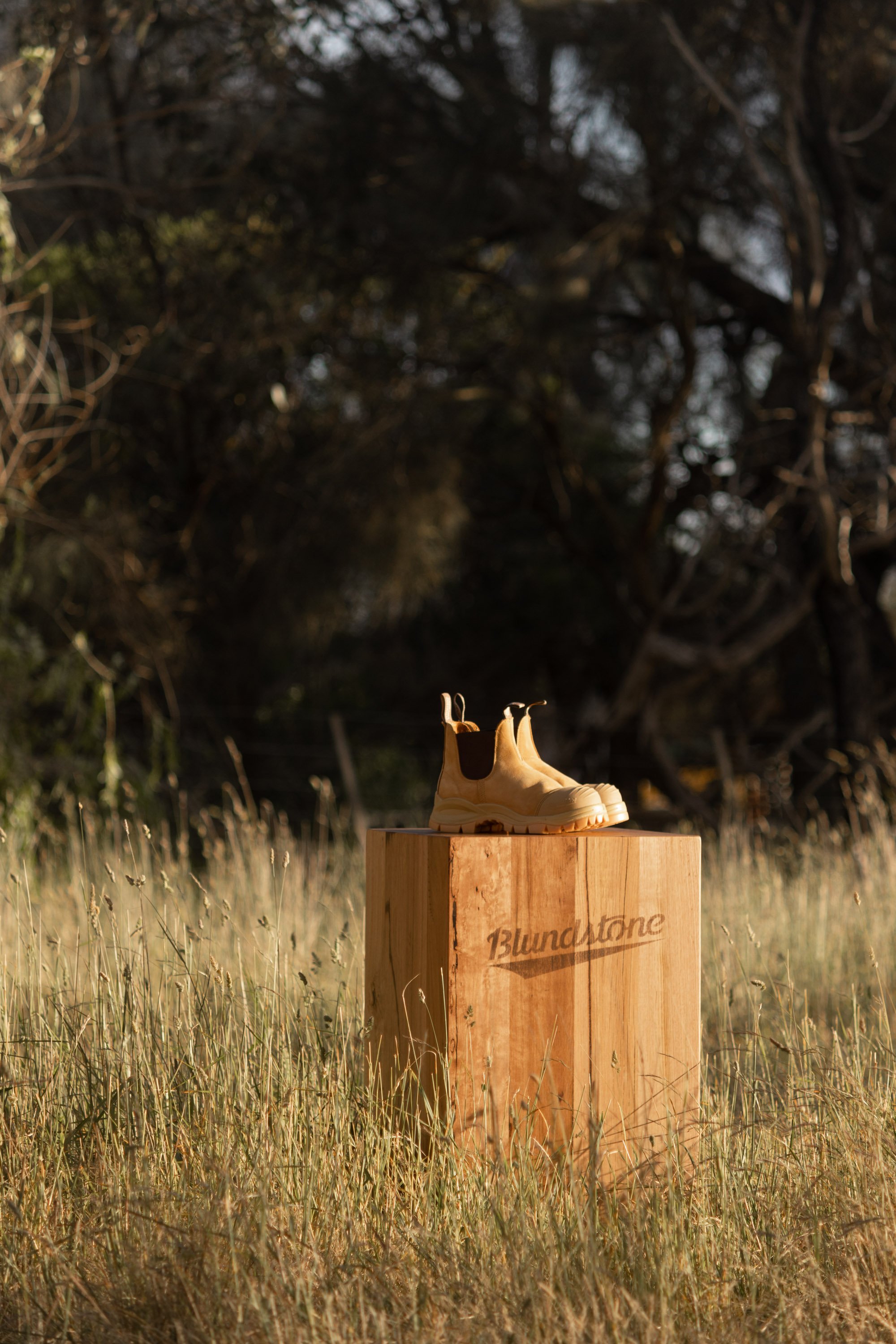
It only felt right to put some out in the paddock next door to get some photos! We are so happy with the finished result. It’s pretty amazing to think that this timber has been pulled out of old houses and will now live in shopping centres across Australia.
Shop the look:
More On DIY
G’day!
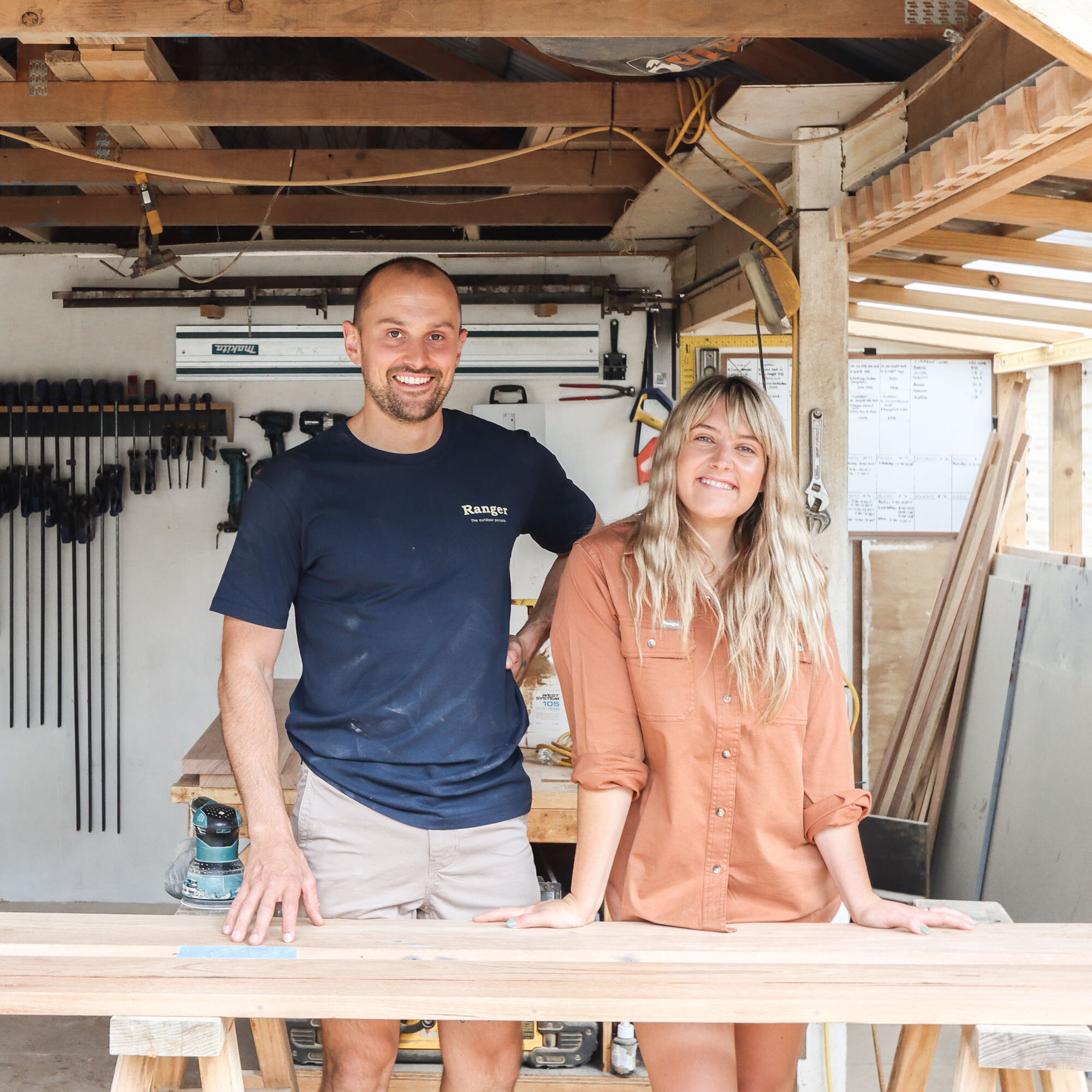
We’re Al + Imo
We’re a husband and wife duo, building our dream life one DIY project at a time. We are proudly self-taught, furniture-makers, business owners, designers and stylists.
DIY RUNS IN OUR DNA
We firmly believe what you learn should be shared which is why we created our Journal. A place where you can learn new skills and be inspired by other creatives.

